The New Logo for Mirra Bella — The Mirror of Beauty and Health
Mirra Bella is more than just a beauty studio. It’s a project with a soul. For over 15 years, the brand has been helping women not only care for their appearance but also find inner harmony. At the core of Mirra Bella is a holistic approach to health, combining physical, emotional, and spiritual wellbeing.
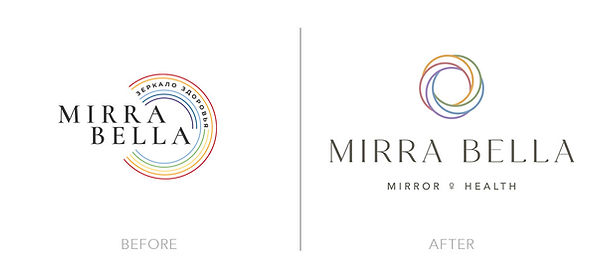
As the company began to grow and expand into new areas, it was time to update the brand identity with a logo that could reflect its mission and values more clearly.

Creative process
Understanding the Brand
Visual Exploration
Mirra Bella is a continuation of the earlier project, Mirror of Beauty.
The idea is to offer women a comfortable and supportive environment where they can explore different areas of life and gently improve them through diagnostics and holistic care.
The new logo needed to:
- Feel feminine, but not cliché
- Evoke symbols like mirrors, water drops, and soft ripples
- Carry a subtle sense of magic
- Work well across all platforms (website, Instagram, print, video, packaging)
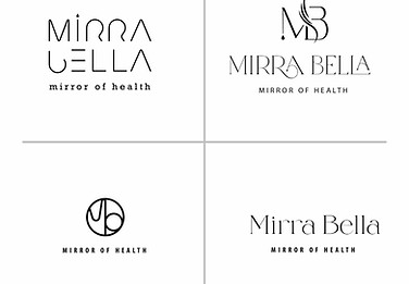
I started with four visual directions to better understand the mood, symbols, and overall aesthetic that fit the brand. This helped us align on the right style before jumping into full logo development.

First Logo Concept
The first version was based on a monogram “MB”, with flowing lines representing the connection between beauty and health. A small star was added below as a nod to light, magic, and the high quality of products used.
The shape of the letter B subtly resembled a butterfly, a symbol of transformation and femininity. It was also an indirect reference to the childhood fairytale Maria Mirrabella, where one of the characters is a butterfly.
While the visuals were appealing, the client felt the butterfly reference was too obvious and not quite aligned with her vision.

Moving Forward:
From Monogram to Symbol
Expanding the Concept:
Color Logic
Final Logo
After receiving feedback, I changed direction.
Instead of relying on letters or recognizable shapes, I focused on building a symbolic form that would feel more abstract and meaningful.
I developed a soft, circular logo made from flowing, colorful lines that represent a ripple, a drop, a mirror. The form reflected harmony and the holistic nature of the brand.
As the brand expanded into new areas, I wanted the logo to reflect its full range of services. That’s when I decided to use color to represent each direction of the business.
Each color in the logo was chosen carefully based on color psychology:
- Old Pink (#c57e81) – Mirror of Beauty: femininity, calm, gentleness
- Champagne Gold (#e3a855) – Education: brightness, elegance, confidence
- Moss Green (#92a579) – Mirror of Health: vitality, freshness, balance
- River Blue (#789dc1) – Beauty in a Drop: trust, purity, clarity
- Violet (#9f87bf) – Mirror of Reality: creativity, intuition, emotional depth
The final version of the logo unites all colors in one circular form, symbolizing wholeness, connection, and a holistic approach.
Each line flows into the next, reflecting how every part of a woman’s life is connected.
I also created alternate versions of the logo, each highlighting a single color for different brand areas. This makes the branding more flexible and helps users instantly recognize the theme of each direction.
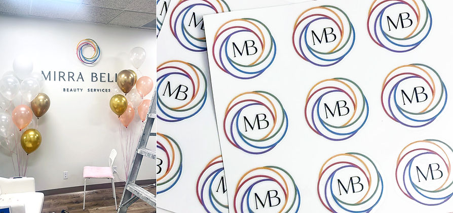
Where the Logo Is Used
The Result
- The upcoming website (built with Astro, which is my next project)
- Instagram and social media
- Business cards and printed materials (designed by me)
- Videos, packaging, and studio branding
The final logo was approved and loved by the client.
It’s elegant, meaningful, and easy to apply across platforms. Most importantly, it reflects the brand’s philosophy and emotional value, helping create a stronger connection with its audience.

Conclusion
This project shows how a logo can go beyond just a symbol, becoming a reflection of the brand’s soul. Through exploration, feedback, and thoughtful design, we arrived at a result that feels true, beautiful, and timeless.

